I decided to create an infographic about sexual assault in honor of Sexual Assault Awareness Month happening through April. I wanted to create an infographic that I could share with others, just to relay some knowledge about the subject. My plan is to distribute these at wo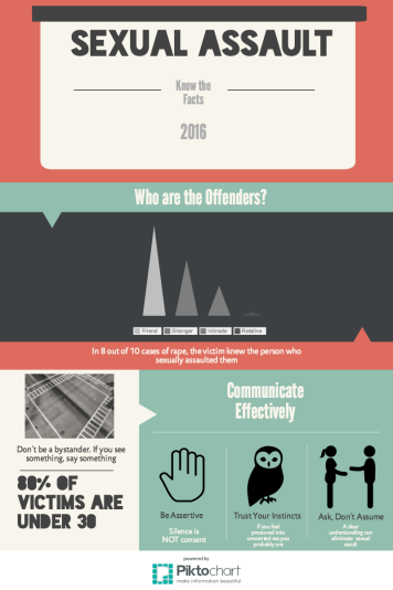 rk during the month of April and at our Violence Resource Fair at UWM (April 27th).
As I created this infographic, I took note of some things I had to do in order to be successful. First I needed to do my research. I wanted to present correct information, so I went to various websites, gathered what I felt was important, and got that ready to add to my graphic. Pulling the research together was actually fun to do because I felt I had a purpose for it. I feel that high school students would feel the same way. Students would engage in this activity because they feel a sense of purpose for it .
I used Piktochart to create my beautiful infographic. This website was amazing! They had so many templates to choose from. Choosing a template actually took me a lot of time, but there was a good reason for it. I wanted to find a template that expressed the mood and didn’t have clutter. I wanted my composition to be neat and appealing to the eye to best share my knowledge. I also had to make decisions about which icons and pictures worked best with the theme of each statement. All my decisions started to come together to create a digital writing piece I would happily share.
Creating my infographic was a lot of fun and engaged me in the subject matter I was attending to. Jenkins writes, “The individual is willing to go through the grind because there is a goal or purpose that matters to the person.When that happens, individuals are engaged, whether that be the engagement in professional lives or the learning process or the engagement that some find through playing games” (23). Students can play around with something (like creating piktocharts) and learn about the subject matter teachers want. And students feel they have accomplished something with purpose, maybe even something they would be willing to share.
(In case you would like to see a closer up of my infographic Click Here)

I love how your infographic has a purpose. And I also love how you’re going to distribute your piece at work. I also used piktochart to create my infographic, and I agree that it was a lot of fun. I feel like students would enjoy creating something that has meaning for them personally. It could be a great way for students to get involved.
LikeLike
Great job, Emily! I liked that while your infographic tackled a very difficult topic, it was not “preachy,” but rather colorful. If it was designed as an article, students would not want to read it, especially with a topic that some may be uncomfortable with. Students should be allowed to find creative ways to present topics that are meaningful to them, instead of having to stick with conventional methods like essays.
LikeLike
This is nice! Colors look really good, and the Z-flow of the page (I learned that ish in J-school, whoo!) is effective and gives the reader an easy way to navigate the page.
LikeLike
With April being the Sexual Assault Awareness month, you couldn’t have picked a better time to present these ideas. I like a lot of the ways you designed your artwork. It doesn’t have too much information, and it leaves the average passerby interested in learning more about it. I also liked your use of agender pictures. A lot of times men are considered the only perpetrator of these acts, and it is reinforced through many popular images and slogans (don’t be that guy, for example). This alienates nonwomen, and become objects of humiliation. You did a good job of not doing that. Also I liked the use of colors, as it emphasized each little part.
LikeLike
Your infographic looks great! I didn’t know that there were websites that helped put infographics together, that would definitely be a neat lesson for students. It would integrate technology in a fun and interesting way into the classroom. Nice work!
LikeLike
I agree with the crew of others who have applauded your infographics representation of topic. I’m impressed as well with how you describe your process. Your discussion of selecting the template was powerful in terms of how using these different tools for “writing” asks us to think about our topics in different, often more complex ways. Kudos to you for being able to describe that experience in words!
LikeLike
Oh and here’s a short blog post describing 7 other ways you can use infographics in the English classroom:
http://larissaslanguages.blogspot.it/2014/01/7-ways-to-use-infographics-in-english.html?m=1
LikeLiked by 1 person